Design
How we wrote 260 potion names
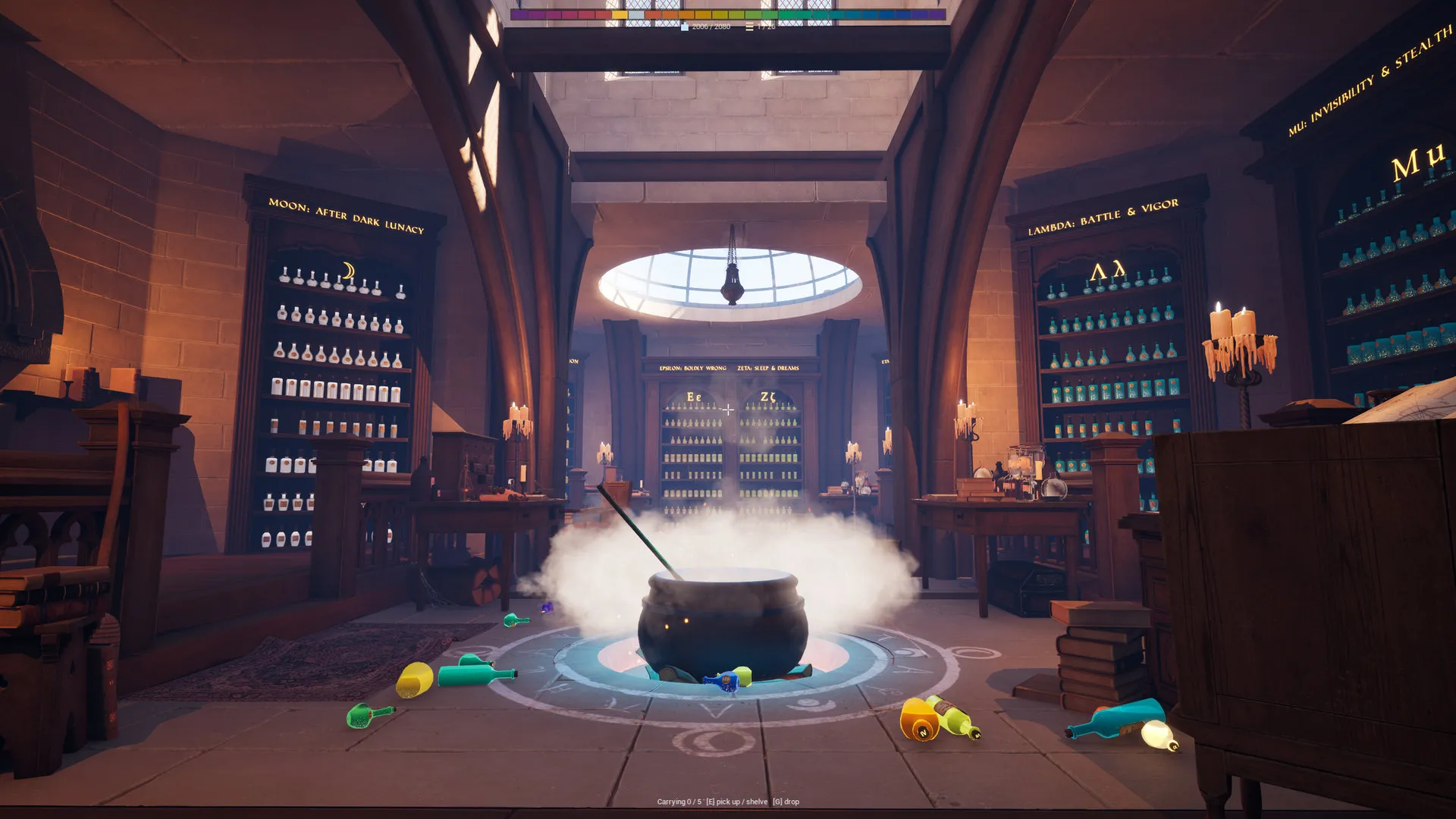
Twenty-six shelves from Alpha to Omega, a gold Sun shelf, a silver Moon shelf, and 260 jokes that had to survive being read twice.
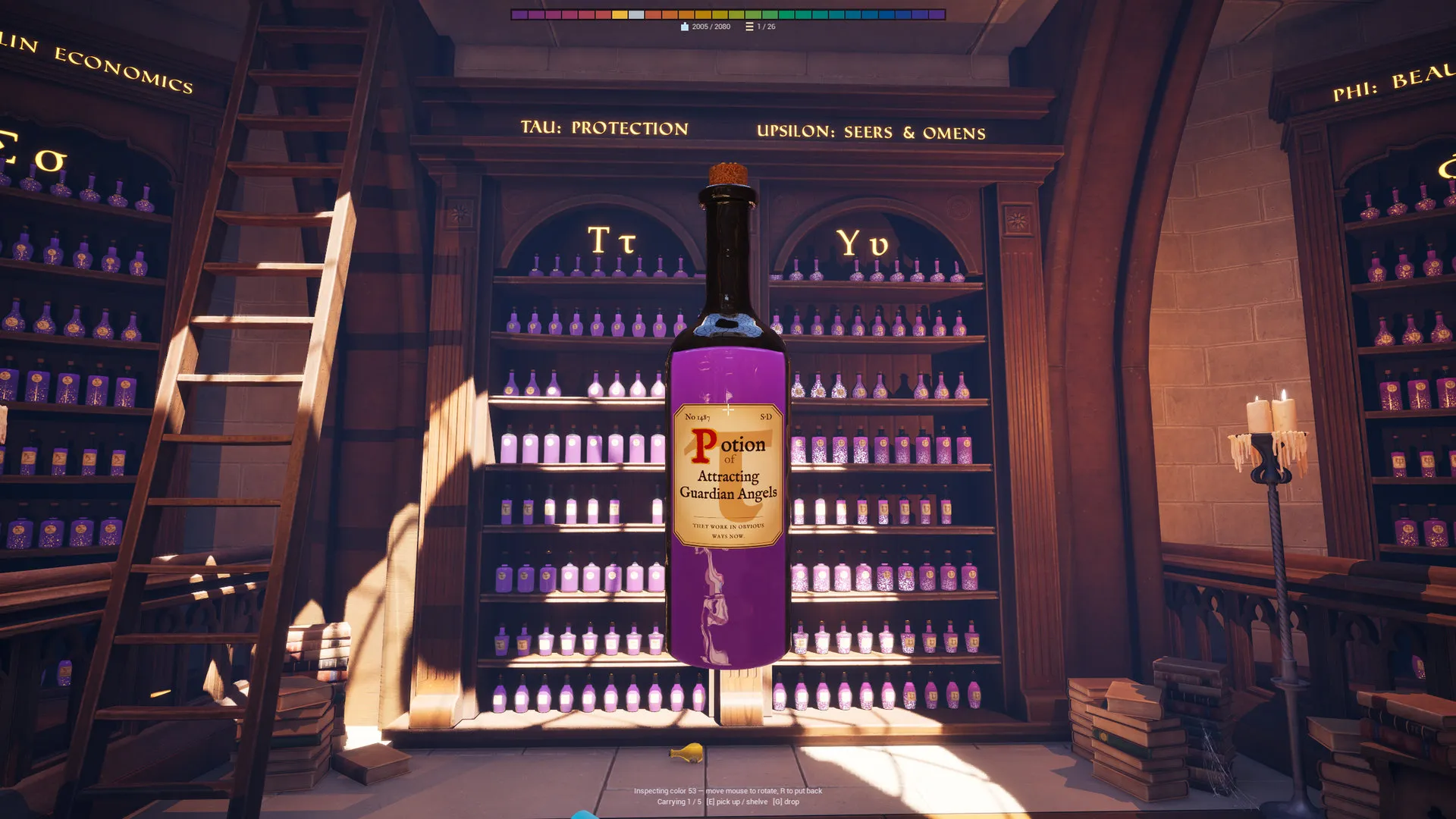
Two thousand and eighty bottles is a lot of bottles. Two thousand and eighty names would have been unreadable — not because we could not write them, but because nobody can hold that many jokes in their head while also trying to tidy a room.
So the shop has 260 names, spread across eight bottle shapes and numbered No 1 to No 2080. You meet a name more than once. That repetition is deliberate: the second time you pick up Tonic of Invisible Until the Bill Arrives, you already know which shelf it wants, and the small pleasure of knowing is the thing we were designing for.
The shelves came first
Every name had to belong somewhere before it was written, so the 26 shelves came first — Alpha to Omega, plus a gold Sun shelf and a silver Moon shelf that sit outside the alphabet.
Alpha is Beginnings and Premieres. Gamma is Glow and Radiance. Zeta is Sleep and Dreams. Kappa is Ghosts and Yokai. Sigma is Goblin Economics, which is where the bill arrives. Omega is Dramatic Exits, and it is the funniest shelf in the shop because everything on it is leaving.
Writing to a shelf is much easier than writing into a void. Poltergeist Paying Monthly Rent is a Kappa problem and a Sigma problem at the same time, and deciding which one it is was most of the work.
The rule we kept breaking
The rule was: the name should be funny once and useful forever.
Funny once, because you will read it, smile, and move on — a name that demands a second laugh becomes tiring at bottle four hundred. Useful forever, because six hours later, in a half-empty shop, the name has to still tell you where the bottle lives.
Elixir of the Lich Who Just Wants a Hug passes. It is a small joke, and it is unmistakably a Kappa bottle. Concoction of Exploding Into Confetti (Should Un-Explode After) passes on the joke and only barely on the second test, which is why the parenthetical is set smaller on the label.
Plenty of names failed. The ones that failed were almost always the ones we liked most when we wrote them.
Printed, not generated
Every label is properly set: aged parchment, a letterpress watermark carrying the shelf’s Greek letter, a vermillion drop cap edged in gold, type positioned by hand. There is no AI art anywhere in the game, and there is none on the labels in particular, because the labels are the writing and the writing is the point.
If you disagree with any of the 260, all of them are plain text files. There is a whole post about that.